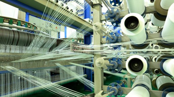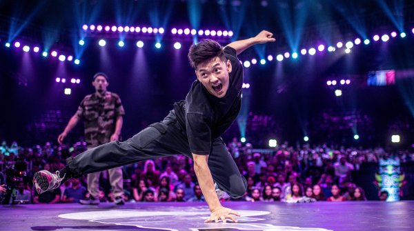
As with previous seasons, the color card consists of the Core palette, the key to the season that consists of seasonal bestsellers and adjusted tones. Four satellite color palettes have also been launched, working with the core as accents or dominant tones in creating new directions for the season.
The seasonal color palette is developed alongside the mega trends and textile trend information, to encourage an on-trend delivery from the ground up as textile manufacturers become much more creative in their collections, enabling them to deliver to the brands sourcing and speeding up the supply chain. The information forms part of the selection process for ISPO Textrends, with the final results being highlighted at the ISPO Textrends forum at ISPO Munich in February 2019.
A reassuring mood emerges for the season, as comforting tones appeal, spiked from time to time with sharp brights. The Core color palette takes on a sense of nostalgia and simplicity, a feeling of bright tones filtered down. Far from looking faded, they are calmingly strong.
Inspiration for the satellite color palettes teams nature with technology and a forceful vibrancy that will shake up the season. Associated with renewal, growth and harmony, green tones feature throughout the color groups, an encouraging sign for the season interpreted in different tones.
Slightly weathered, the traditional primary tones get a wintry filter effect applied. Winter sky blue finds a place as does indigo, a new alternative to black. Vigor, energy and determination associated with red reassures the consumer, offered in a nostalgic rich red through to a sharper interpretation.
In our fast-paced world the palette here embraces the luminosity of light on surfaces. The overall look can be worked to a natural advantage or through the addition of applied luminosity for a futuristic and sharp palette.


Natures’s natural talent pushes through in rich and vivacious deep tones offset by neutral tones. The colors will respond differently, with natural fabrics taking on a deep richness, and membranes and coating through to bright synthetics using these tones to a more jeweled delivery.

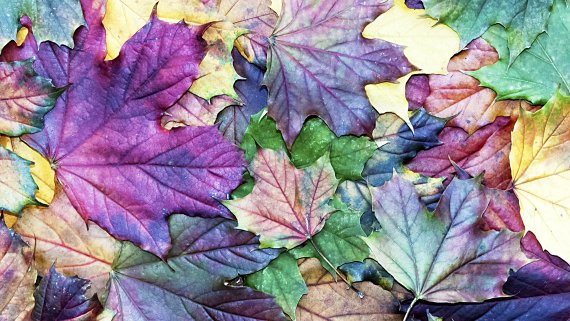
Disruptive, irregular and lively, this symphony of colors clash and collide. The palette can be used as solids or creatively chaotic through prints, the level of color from minimal to maximum shout out. Fluorescent and neon feature, pushing this color group to an intense new level. Perfect for working with black and grays.

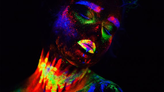
Iridescence and gleaming substrates will electrify this pastel-looking group. Artificial light tones are key, achievable through tri-lobal performance yarns and glossy membranes. The scale of working this color group on different substrates can be subtle through to laser optic brightness and awe.


 ISPO TextrendsMore diversity outdoors: Polartec leads the way
- Awards
- Mountain sports
- Bike
- Fitness
- Health
- ISPO Munich
- Running
- Brands
- Sustainability
- Olympia
- OutDoor
- Promotion
- Sports Business
- Textrends
- Triathlon
- Water sports
- Winter sports
- eSports
- SportsTech
- OutDoor by ISPO
- Heroes
- Transformation
- Sport Fashion
- Urban Culture
- Challenges of a CEO
- Trade fairs
- Sports
- Find the Balance
- Product reviews
- Newsletter Exclusive Area
- Magazine


