Colors enhance the consumers mood, encouraging a better performance. A sense of wellbeing and elevated feel-good factor enable a stronger focus on the activity. Psychologically color can aid the wearer, but more importantly it can attract the consumer at point of sale. Black, grays and neutral tones continue to be integral to the sports and outdoors market, cleverly accented with contrasting tones on a varying scale from trims through to textiles from the satellite palettes.
Kicking off each season with the CORE palette, the platform for key tones that compliment and can be interworked with the four satellite color palettes. An array of inspiration defines the colors, but they all convey identical messages of a positive outlook for the season.
The CORE color palette continues in strength, enhanced and reenergized through the inclusion of turning up the primary tones that feature in the bestselling sportswear colors, that many regard as the pinnacle of each season’s collection. This season also sees a bolder use of neutral hues offering a sharper delivery that compliments the satellite color palettes. The color data provided is inspired by elements ranging from organic and natural through to new ideas as well as reworking past Eureka moments.


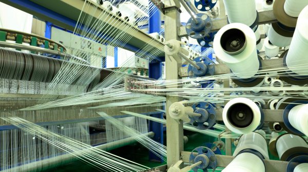
A dream of escape or the real deal in a daredevil action? This soft and striking palette can be worked whimsically in a matte direction or taken to a bolder and more intense look, especially for outer layers. The key to this palette is freedom, it subtly moves and compliments, working seamlessly with color options from the CORE palette.


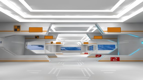
A vision of the future from the past inspires, as white makes a stronger statement pulled from the Core palette in engaging with retroesque tones that were once futuristic in the past. Orange and light gray compliment, influenced by a sharper neon blue. This is a nod to those visionaries of the Seventies, who correctly predicted the technology that surrounds us.


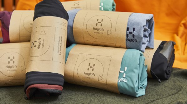
A warm and wintry palette that is truly dedicated to mother nature. From rich russet through to frosty dew tones and winter sky blue. This color option is clean, crisp and concise on one hand, on the other it can be interpreted as a very snug choice depending on the final application.


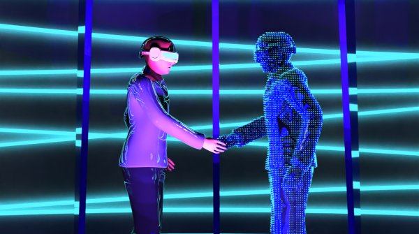
Artificial, electrifying and energetic in delivery, ACUTE offers a sharp uplifting effect, especially when worked with colors from the CORE palette. Striking whatever the amount used, from a hint of topstitching or from trims through to allover applications, ensuring there is a movement and transience about this palette with an inkling of the unexpected.


- Awards
- Mountain sports
- Bike
- Fitness
- Health
- ISPO Munich
- Running
- Brands
- Sustainability
- Olympia
- OutDoor
- Promotion
- Sports Business
- Textrends
- Triathlon
- Water sports
- Winter sports
- eSports
- SportsTech
- OutDoor by ISPO
- Heroes
- Transformation
- Sport Fashion
- Urban Culture
- Challenges of a CEO
- Trade fairs
- Sports
- Find the Balance
- Product reviews
- Newsletter Exclusive Area
- Magazine


