Louisa Smith is a globally recognized textile and fashion expert. Her innovative spirit and expertise make her a sought-after opinion leader in the textile industry - also in the sports and outdoor sector. She is a leading jury member for ISPO Textrends Awards and presents them once a year at ISPO Munich. Louisa also supports the ISPO Award team with a sustainability check and checks the sustainability information of relevant products - for more transparency and real change in the sports world.
What does color mean to you? Is it the visibility, the warmth, the audacity, or the understated elements a hue can bring to a product? Despite the naysayers who say color trends should not exist, color is essential to us as consumers, not just for personal taste, but for various reasons.
From protective elements in the sports and outdoor sector to camouflage aspects for safety. Color connects brands’ logos with consumers, stimulates the brain, and also can have an emotional effect on us, as well as featuring in different cultures.
Color identifies boundaries and indicates opposing teams in sports; it can be spicy, fluorescent, or gentle in pastel hazy tones. It can reflect light and heat and identifies the pole position in racing and team sports for avid sporting spectators. It influences how we react to situations, an important aspect of the sports and outdoor industry. Most importantly, color is key in what sometimes can be seen as a very gray world.
At ISPO Textrends, the Fall/Winter 26/27 color palettes aren’t directives; they share the direction in which we see inspiration in many areas through lifestyle, technology, textile developments, sport, music, and art, from street to classical. The colors that take a position in the palette for the season are a result of our research. We aren’t here to dictate that particular hues should dominate, instead, we are sharing our ideas. You are the creatives and designers; you know your market, your consumers, and, hopefully, your product range. We want to share our color moods, complementing existing palettes you may be working on, for you to pick and play with as you choose.
For many brands, certain colors run season to season, which makes sense when you have the perfect recipe for a color that sells, a sustainable option with lab dips confirmed, and the CMYK defined in the dyestuff. Color is subjective; an injection of new colorways can also be incorporated through trims and accessories to update established tones, color can take on a different appearance depending on the substrate.
Color tones can be further enhanced through lacquered performance finishes, delustered effects, and new print techniques, all pertinent in the outdoors sector, especially with protective coatings and membranes. Whether natural or synthetic, wet dyed, yarn-dyed, sublimation dyed or piece dyed, digitally printed or dope dyed, whatever the final decision, the color will create character befitting the fabric or trim.
With ISPO Textrends, the color palettes shared for the season aren’t just shared for textiles, they are here to inspire all soft equipment and hardware related to sports and outdoor activities.
The color spirit we publish each season is inspired by cultural and consumer moods we are picking up globally. We aren’t here to enforce any one color and berate a brand if it breaks rank. We aim to share and collaborate, so we always lead with a CORE palette plus four satellites for interplay. You don’t have to introduce an entire new color range each season. ISPO Textrends’ color offering aims to be suggestive. You can mix and match, pull and accent, or take on the whole hue.
Whether it is a seasonal colorway or a tone for tipping, color will always be important, but it must also come from the brand's creative soul. This season’s palettes take on carousel-inspired circularity—pick and mix or play it safe—the choice is yours!
As with many brands, a core palette is the anchor of each season. Here, you will find your classic tones, black and white, and variations of the primary color palette, red, green, yellow, and neutrals.
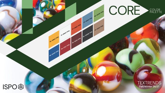
This season, the CORE inspiration pulls from a stoic direction. Strength and clarity are features as we run with our traditional black, white, and grays, with the traditional primary tones taking on a more refined hue. There is an intensity to this season’s CORE—bold, strong, and clear—an ambitious oxymoron for the base rock as hues appear differently depending on the fabric content and finish.
The concept of the satellite palettes is to interplay tones with core colors and existing bestsellers. The satellite palettes can also contrast and complement each other too, this is all about being playful in achieving the best result for your brand.
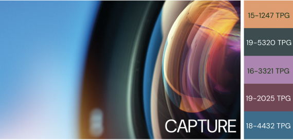
The prismatic color of a glass lens inspires this palette, as dark tones contrast with the flicker of light-enhancing rays of orange and pink. This color offers luminosity, which it could achieve in lacquered looks, from foil prints to lustrous coatings, and holds appeal. There is a precision to the colors used, perfect and pure in their intensity.
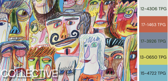
A sensational range of accents that highlight the brights with the neutrals, as a new energy emerges, a creative overthrow as human-to-human collectiveness comes through with a clashing crash of tones. Anything goes; there are no rules! This is very much tied to the pre-loved, repair market, and also associates with the consumers’ sense of chaos with a retro appeal.
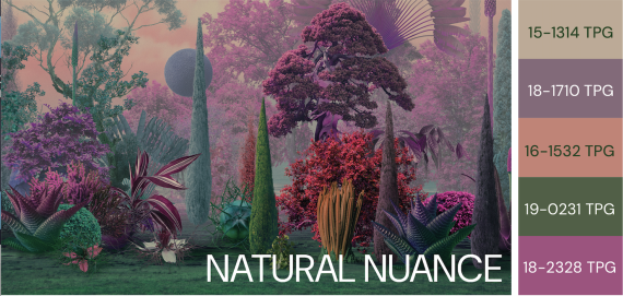
Modern mythology embraces AI and the metaverse, and the wonders that nature expels in colors. This is digital nature at its finest. It will go deep and mysterious in matte substrates and electrify the palette when it comes to iridescence finishes. The nuances emerging this season are taken from nature’s color core, but finished with an artificial coverage.
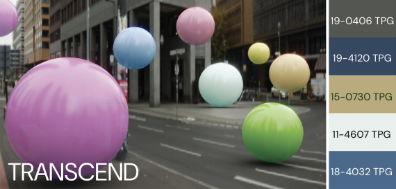
A sustainable approach to brand developments, connected with tones from this season’s CORE—specifically the white—is bright and bold to uplift and outshine the dominance of deep earthy and urban tones. Diversification as urban outdoors continues. This is about transcending boundaries and pushing inclusivity and diversity, leading to greater consumer efficiency. The urban jungle inspires, with layers of architecture designed over the centuries teamed with the sleek and intensity of modern technology and living.
Color ref credit:
- PANTONE® and other Pantone trademarks are the property of Pantone LLC.
- Pantone® TPG color references are for general guidance only.
 ISPO TextrendsISPO Textrends Jury Meeting for Spring/Summer 2027
 ISPO TextrendsSustainable materials: trends fall/winter 26/27
- Awards
- Mountain sports
- Bike
- Fitness
- Health
- ISPO Munich
- Running
- Brands
- Sustainability
- Olympia
- OutDoor
- Promotion
- Sports Business
- Textrends
- Triathlon
- Water sports
- Winter sports
- eSports
- SportsTech
- OutDoor by ISPO
- Heroes
- Transformation
- Sport Fashion
- Urban Culture
- Challenges of a CEO
- Trade fairs
- Sports
- Find the Balance
- Product reviews
- Newsletter Exclusive Area
- Magazine
