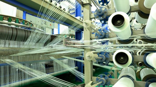
The launch of the ISPO Textrends Spring/Summer 2022 color trends falls under the overall inspiration of the rehumanizing mood. There is a move towards a new soft and kind appeal that still has vigor, as we continue to embrace digitalization but maintain the integrity and creativity that humans bring. A balanced and harmonized path is required, as we move forward, working digitalization to our advantage, whilst maintaining our unique ID.
From ingredient brands, brand developers and designers can mix’n’match the season’s color offering with existing bestselling seasonal tones. Brands, you know you customers, you know your product range, work the colors as to how you see fit. We don’t have to be sheep, brands need to take creative control pulling from in-house ideas as well as what is suggested. We aren’t dedicating a key for the season, we want to provide a springboard in creating innovative collections and overcoming the sameness that global consumers bemoan of.
Sharing is the new caring, which is why ISPO Textrends is regarded as the starting point for the new season, with colors, Mega Trends and textile trends released in preparation for the product applications that will be displayed at ISPO Textrends Outdoor by ISPO and ISPO Shanghai.
With so much focus on previous seasons on sustainability, creativity was put on the back burner, and now it is back, especially with the use of this season’s color palettes. Consider the luminosity and brilliance that these tones can bring through glossy membranes and deep matte surfaces. Play with tones as accents or solids, working with trims and unique yarn-dyed effects.
There is a new sophistication emerging in the CORE palette for Spring/Summer 2022, as a sharper delivery of neutrals and recurring best-selling tones get a kick to them. These are strong nuances that make the backbone of the collections for apparel, footwear, soft equipment through to accessories. Worked matte or bright, the perfection of this palette renews our faith in control and confidence with solid undertones.
Four Satellite Palettes complement the Core palette, designed to interchange with the satellite colors. Used as accents or solids, interplay with the season’s hues to enhance the creativity that we are seeking.

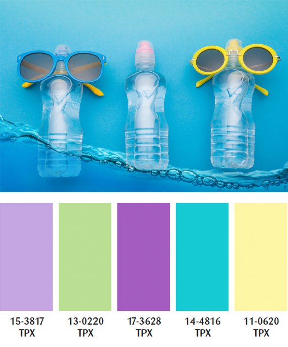
K-pop inspired, this is a bittersweet, sharp direction. Cool touch fabrics feature in a refreshing approach for a chill factor. A synthetic mood that can easily interplay with the core palette. Work it fully, work it matte, work it bright, but most of all work it in a way that it will pop!
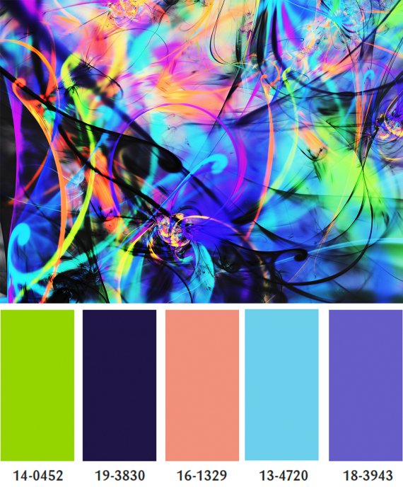
Disruption is becoming ubiquitous in today's world, and this palette takes a divisive use of bold and neon tones creating a rebellious spirit, and a 'bring it on' attitude. Clashing, combative, chaotic in prints and yarn-dyed effects or just using a tone as a solid, the identity of this palette is positively kicking.
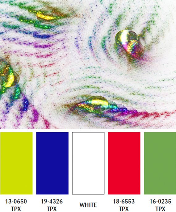
White is a key component for the Spring/Summer season but it is the flashes of primary tones offered in a new metallic level that catches the light. Irregularity rules, but there is also a geometry coming through. There is a method in its madness, in delivering a new glistening direction for the season. Not just for textiles, let's take this to a new level in trims and accessories.
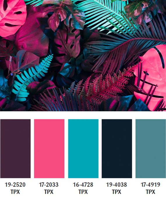
Nature harmoniously sings out, but whilst classic natural tones feature on the core palette, the focus here is taken up a notch as we look to exotic and vibrant tones and. A new depth to indigo features, complementing the importance of nature, as inspiration is crucial in maintaining our connection with the true wonders of the world.
 ISPO TextrendsISPO Textrends: Mega trends on the way to a positive future
 ISPO TextrendsISPO Textrends: Colors remain in flux
- ISPO awards
- Mountain sports
- Bike
- Design
- Retail
- Fitness
- Health
- ISPO Job Market
- ISPO Munich
- ISPO Shanghai
- Running
- Brands
- Sustainability
- Olympia
- OutDoor
- Promotion
- Sports Business
- ISPO Textrends
- Triathlon
- Water sports
- Winter sports
- eSports
- SportsTech
- OutDoor by ISPO
- Heroes
- Transformation
- Sport Fashion
- Urban Culture
- Challenges of a CEO
- Trade fairs
- Sports
- Find the Balance
- Product reviews
- Newsletter Exclusive Area
- Magazine


